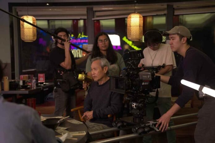
Arushi Mathur, a production designer from India, has rapidly emerged as a leading creative voice in international film and media. With a background in architecture and a passion for visual storytelling, Arushi Mathur has shaped the look and feel of acclaimed projects across genres and platforms.
Her work on the short film Unalived earned official selections at major festivals like Cinequest, HorrorHound, and Cleveland International. She has also shaped the visual identity of widely viewed digital content such as Daddy Mommy Don’t Divorce (2.6M views, IMDb 8.4), Secrets of Sin, Broken, and Red Pocket – a finalist for the Deutsche Bank Frieze Los Angeles Film Award.
Arushi Mathur’s visual language seamlessly moves between arthouse and commercial realms, from evocative short films like Mis-Alignment (screened at Palm Springs ShortFest, now streaming on MUBI) to high-profile campaigns such as the Matua Wine commercial.
Mathur shares insights into her creative process, visual instincts, and how she blends her Indian heritage with a global perspective to bring stories to life across cultures and formats
Your production design in Unalived helped it resonate deeply with audiences and festival juries alike. How did you go about crafting its psychological and visual tone?
Arushi Mathur: Thank you. For me, every project begins with a deep dive into the script and understanding the emotional core of the story. I try to build environments that support the narrative and evoke the right feelings in the audience. Collaboration with the director and cinematographer is also key to ensuring the visuals serve the story. For Unalived, we focused on creating an atmosphere that reflected psychological tension—subtle shifts in color, texture, and space helped build that immersive world.
With Daddy Mommy Don’t Divorce reaching millions, what design choices made the story feel so personal and believable?
Authenticity is everything. I focus on emotional truth—spaces should feel real, lived-in, and intimately connected to the characters’ inner lives. On this project, I paid special attention to everyday details—family photos, children’s drawings, worn furniture—that ground viewers in the reality of the story. I also used color and lighting strategically to reflect emotional shifts within the family dynamic.
In a complex miniseries like Secrets of Sin, how do you design for narrative layers and character duality?
Every detail on set should serve the narrative. For complex stories, I use visual cues—like color contrast or symbolic objects—to create layers of meaning. In Secrets of Sin, the duality of the character’s life was reflected in set design choices: clean, symmetrical lines in one world versus chaotic, textured spaces in the other. These contrasts help the audience intuitively feel the tension without being told.
How do you make sure your designs connect with online audiences who have limited attention spans?
Visual impact is crucial in digital-first content, where viewers scroll quickly and attention spans are short. A compelling visual environment can grab someone in the first few seconds and hold them. But beyond that, it’s about emotional resonance. If a space feels honest and reflective of the character’s reality, viewers connect—and they stay.
Being a top 10 finalist for Red Pocket must have been a big moment. What did that recognition mean to you creatively?
It was incredibly meaningful. The jury included leaders in film and contemporary art, so to have our work recognized at that level was an honor. It affirmed the creative risks we took—from bold color palettes to abstract design elements. Recognition like that inspires me to keep pushing boundaries.
Your music video Lie to Me received praise for its visuals. How is your process different when designing for music videos versus narrative projects?
Music videos allow for a different kind of freedom. There’s more room to be experimental and abstract. I love using bold colors, surreal imagery, or symbolic architecture that might be too much in a traditional narrative. With Lie to Me, we leaned into emotional extremes—visually and conceptually—to mirror the intensity of the song.
For Mis-Alignment, which reached global audiences on MUBI, how did you strike a balance between local authenticity and international appeal?
Working as a set decorator, I collaborated closely with the production designer to find visual languages that feel both universal and grounded. Shapes, materials, and colors can carry meaning across cultures—but we always rooted our choices in the context of the story. It’s about striking a balance: staying authentic to the characters’ world while still creating visuals that resonate globally.
What’s different about working on commercials like the Matua Wine campaign compared to film or series work?
Commercials are fast and focused—you need to deliver the brand’s message visually and emotionally within seconds. As the set decorator, I worked on translating the brand’s heritage into design elements that felt natural and aspirational. In Matua’s case, we emphasized natural textures, airy color schemes, and clean compositions that spoke to the brand’s New Zealand roots. The key is combining clarity with creativity.
As an Indian designer working across global platforms, how do you integrate your heritage into your visual style?
I’m deeply proud of my Indian roots—they influence everything from my use of color to my storytelling sensibilities. But working globally has expanded my perspective. I’ve learned to appreciate different design philosophies, aesthetics, and ways of working. The most powerful creativity often comes from blending traditions—Indian vibrancy and symbolism with global minimalism or structure, for example. I always strive to honor my culture while embracing new influences.
Arushi Mathur’s journey is a testament to the power of Indian creativity and the importance of design in shaping stories that move global audiences. Through thoughtful craftsmanship and cross-cultural storytelling, she continues to redefine the visual language of modern media.


